Customization of toolbar buttons and item summary in SharePoint forms
Today I would like to present the new release of SharePoint Forms Designer 2.8.1 and demonstrate its main features. You can find the complete list of improvements on our website. In this article I will focus on customization of the bottom panel with buttons and the selected item info.
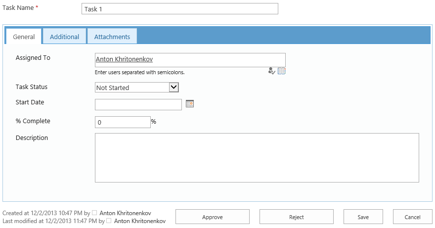
For my small demo I chose the list of workflow tasks in SharePoint 2013. By default, forms of this list contain additional buttons at the bottom and have the following view:
When a user clicks Reject or Approve buttons, Task Outcome column is changed to the appropriate value and the task completes. Based on Task Outcome value workflow detects whether the approval is completed and continues or remains waiting for all the approvers’ decisions.
If we design an edit form with Forms Designer we will get two buttons only: ‘Save’ and ‘Cancel’. To approve task a user will have to select Approved value in Task Outcome drop-down and save the current task. Now I will show, how to add new buttons ‘Approve’ and ‘Reject’ to the bottom of a form and define the same logic for them as they have in default forms.
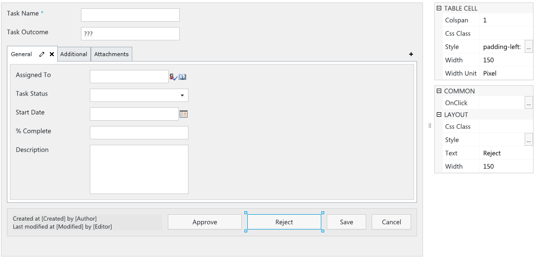
Open Forms Designer, choose Workflow Task (SharePoint 2013) content type and Edit form type. You can find a new toggle button ‘Buttons’ in the ribbon. When it is checked you can redefine the standard toolbar: add or remove Save and Cancel buttons, append additional info into the summary section of the current item, etc. Check it and you will see the default toolbar at the bottom of your form:
Please, pay attention to the text:
Created at [Created] by [Author]
Last modified at [Modified] by [Editor]
Now you can use field values in Rich Text and Plain Text controls. For example, you can put the following text into your form: Hello, [Assigned To]. Please, complete this task by [Due Date]. The text in square brackets will be replaced with the appropriate field values of the current item.
Next, you see Save and Cancel buttons. Choose any of them and in the property grid you will find OnClick property. Here you can define JavaScript, which will be executed when user clicks the button. If you return false in your custom code the form will not be submitted, so, you can define additional validation (e.g. if field A is empty or has incorrect value), next, show an alert message and return false (stay on form).
We will now add Approve and Reject buttons. In the toolbox on the left side of Forms Designer window you can find additional controls Save and Close. They allow to put additional buttons with the same behavior as that of default Save and Cancel buttons. But you can define your custom code in OnClick property. So, I put two Save buttons next to the existing one and change their title to ‘Approve’ and ‘Reject’ via property grid:
Now, we have to define OnClick handler to set Task Outcome field and change Status to Completed. Please, pay attention that you can change fields via JavaScript only if they are on the form. So, you have to place them in your form but if you don’t want to display them to your users you can hide them via CSS. I will demonstrate it below.
Here is the code for Approve button:
fd.field('TaskOutcome').value('Approved');
fd.field('Status').value('Completed');
And for Reject button:
fd.field('TaskOutcome').value('Rejected');
fd.field('Status').value('Completed');
Ok, now we can hide Task Outcome field. Users will change it via Approve and Reject buttons only. Select it in Forms Designer and set Style property on ‘display: none’.
Here is my final form:
Please, leave your questions in the comments. Thank you.


