Designing custom forms for smartphones, tablet devices, and regular PCs
Today we’d like to introduce you our new Forms Designer 3.0.1 feature for building custom forms for various types of devices, be it mobile phones, tablets or regular PCs. For all these types you can now create separate Display, New and Edit forms which enables you to customize the way different devices view your website. Let’s take a look at a use case.
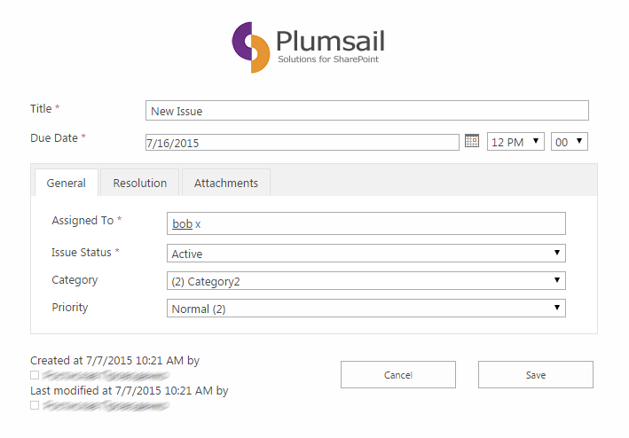
Say we have a form that looks like this:
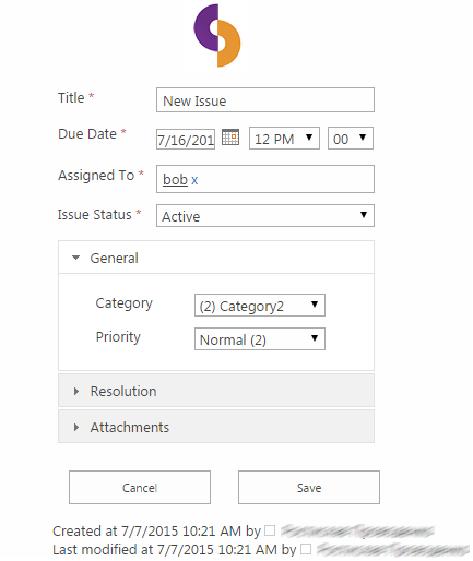
Navigating such form on a mobile device would be pretty cumbersome, as you can imagine. What we need to come up with is something that looks more like this:
How can we achieve this? The short answer would be to use features introduced in Forms Designer 3.0.1:
- fd.isMobileDevice() and fd.isTabletDevice() JavaScript functions
- IsMobileDevice and IsTabletDevice Group values (available only in On-Premises version of SharePoint).
Before we proceed, however, we need to turn off the SharePoint site feature called ‘Mobile Browser View’ as it’s not compatible with Forms Designer. To do this go to Site Settings → Manage site features (under Site Actions) → click ‘Deactivate’ against ‘Mobile Browser View’.
Let us look at a how we would utilize these features for our use case in both versions of SharePoint.
Designing for mobile devices in SharePoint Online
In Forms Designer for SharePoint Online we have form sets, meaning we can create any number of forms for each of the SharePoint form types (Display, New, Edit). Utilizing our fd.isMobileDevice() and fd.isTabletDevice() we can check if our user agent requires a mobile version of our form and redirect him to it.
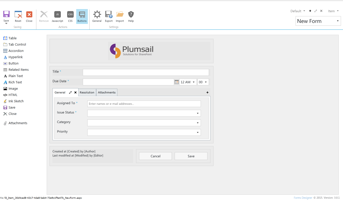
Our initial form in Forms Designer:
Let us add a new form set for ‘New Form’ called ‘Mobile’. To do this, click the ‘+’ button in the top-right corner of the window and get the following dialog:
We’ll enter ‘Mobile’, click OK.
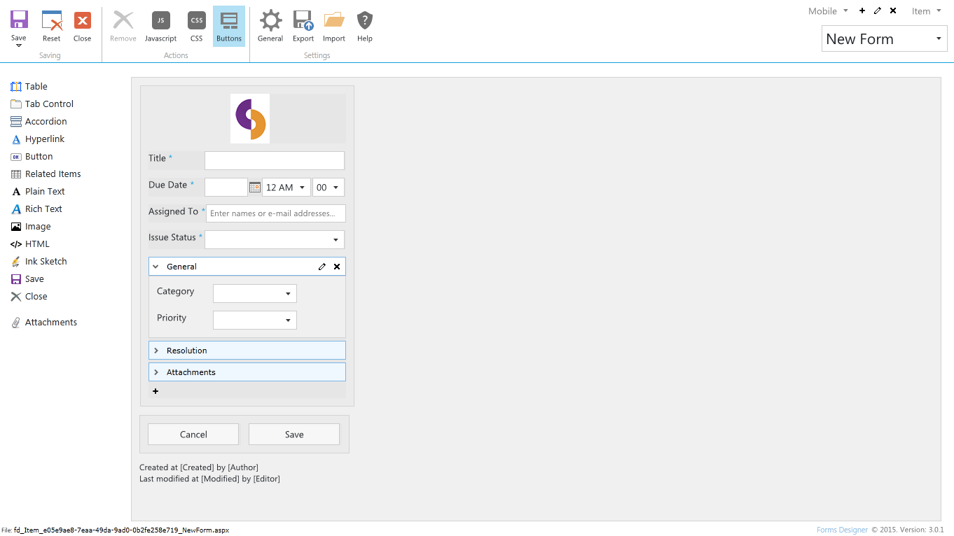
Here we can design a mobile device-friendly version of our form (don’t forget to click ‘Save’, navigating to another form will cause your changes to be lost):
What we’ve done here is created a miniature version of our logo, brought out required fields onto the main window to allow for a simpler fill-in process, replaced the tab control with an accordion and made the whole form is fit a regular sized smartphone (by placing everything inside a table and setting the table’s size – which is also a new feature of 3.0.1).
Before we go further, look at the bottom-left corner of the window where it says ‘File: xxxxxx.aspx’. Take a note of this filename, we’ll need it later when we write our JavaScript code.
Now that we have designed our mobile version of the form we need to implement the redirect logic. Let’s go back to our default ‘New Form’ and open up the JS editor. This is the code we will add:
if (fd.isMobileDevice() || fd.isTabletDevice())
{
fd.openForm('fd_Item_e05e9ae8-7eaa-49da-9ad0-0b2fe258e719_NewForm.aspx');
}
What we’re doing here is:
- Checking if the user is on a mobile device or tablet with fd.isMobileDevice() || fd.isTabletDevice().
- If he is, we’re opening the appropriate form by specifying the filename we have copied above in fd.openForm(filename).
After we’ve pasted in our code with the appropriate filename and saved our form, we’re done. What will now happen is every time a user clicks ‘Add new item’ he will be redirected to a mobile version of the ‘New Form’ if he’s using a mobile phone or a tablet (and if he’s not using a mobile device, he will stay on the initial desktop-friendly form).
The very same procedure would be used if we were creating mobile versions of ‘Edit’ and ‘Display’ forms.
Let’s now have a look at how you could achieve the same thing in SharePoint On-Premises.
Designing for mobile devices in SharePoint On-Premises
The procedure for providing desktop and mobile device versions of a form is even simpler in SharePoint On-Premises: you don’t need to write custom JavaScript code to redirect the user, you can use IsMobileDevice and IsTabletDevice group tokens instead.
Let’s open up the ‘New Form’ form in Forms Designer. We will use exactly the same set-up shown in the previous section.
What we’ll do is add a new group by clicking the ‘+’ button in the top-right corner of the window.
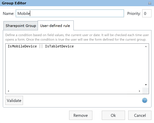
We’ll call this group ‘Mobile’ and in ‘User-defined rule’ tab we’ll add the following code:
IsMobileDevice || IsTabletDevice
Click ‘Validate’ and ‘OK’.
A new form will be created as a copy of the desktop form. We’ll change it to make it look the way we want, as shown in the previous section.
Click ‘Save’, and we’re done. Now whenever user wants to add a new item he will be directed to the appropriate form, depending on the type of device he’s using.
