SharePoint forms styling
In my previous entry I demonstrated how to customize SharePoint forms with Forms Designer tool. Now I would like to show how to customize the views of forms by CSS-styles in the Forms Designer.
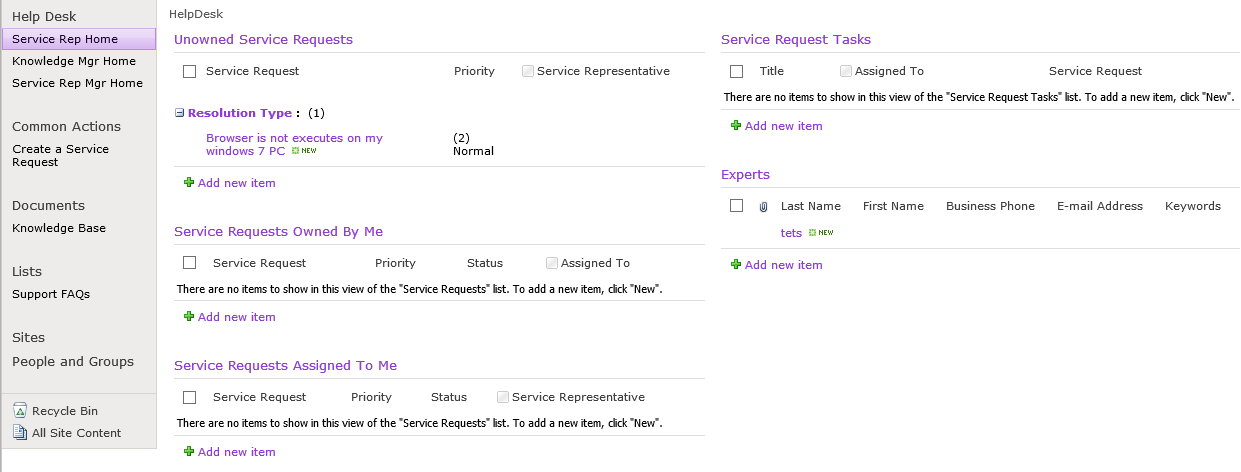
I changed my SharePoint web site theme into one of the standard named ‘Grapello’. Now my HelpDesk has the following view:
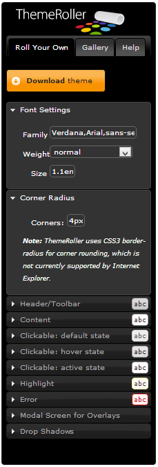
Now I want to change the view of my forms customized with Forms Designer. Since these forms use JQuery UI library I went to http://jqueryui.com/themeroller/ to find an appropriate theme. ‘Eggplant’ fits a lot to my SharePoint theme. You can also define your own theme with easy-to-use ThemeRoller interface:
In the Download Builder dialog box I selected all items in ‘UI Core’ group and ‘Button’ and ‘Tabs’ items in ‘Widgets’ group. All other items were unchecked. After downloading was completed I copied all content from file css/[theme]/jquery-ui-[version].custom.min.css in the downloaded archive and pasted it into Forms Designer CSS-editor:
Now request form acquired the following view:
I found two problems:
- The ‘Select’ elements in the field Date and Time became very small.
- The borders of controls were not changed.
To fix the first issue I removed selector .ui-widget select from CSS. For the second, I added the following CSS-code:
.fd_control input[type="text"],
.fd_control textarea,
.fd_control select,
#fd_form .ms-dtinput input[type="text"],
#fd_form .ms-dttimeinput input[type="text"],
#fd_form .ms-inputuserfield,
#fd_form .ms-rtefield,
#fd_form .ms-rtefield2,
#fd_form .ms-longfileinput,
#fd_form .ms-fileinput
{
border: 1px solid #903CD6;
}
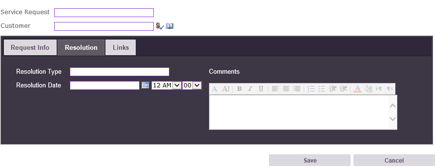
The result is here:
Summing up, I want to say that it is very easy to define your own style for Forms Designer view with JQuery UI Theme Roller utility. Alternatively you can choose one of the existing themes. But it is important to check your form after applying a new theme because there may occur some visual problems that will have to be fixed with quick modifications of CSS.


